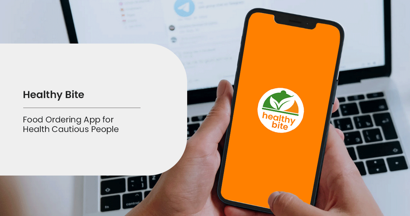
Healthy Bite
WHY I CREATED THIS APP
I created this app to help people finding healthy and nutrition-based food online and deliver it at their doorstep. In today’s scenario after pandemic when people are focusing on their heath and trying to follow a healthy lifestyle but running with short of time this app will help them and solve their problem to find good and hygienic food and make ordering process smooth and quick.
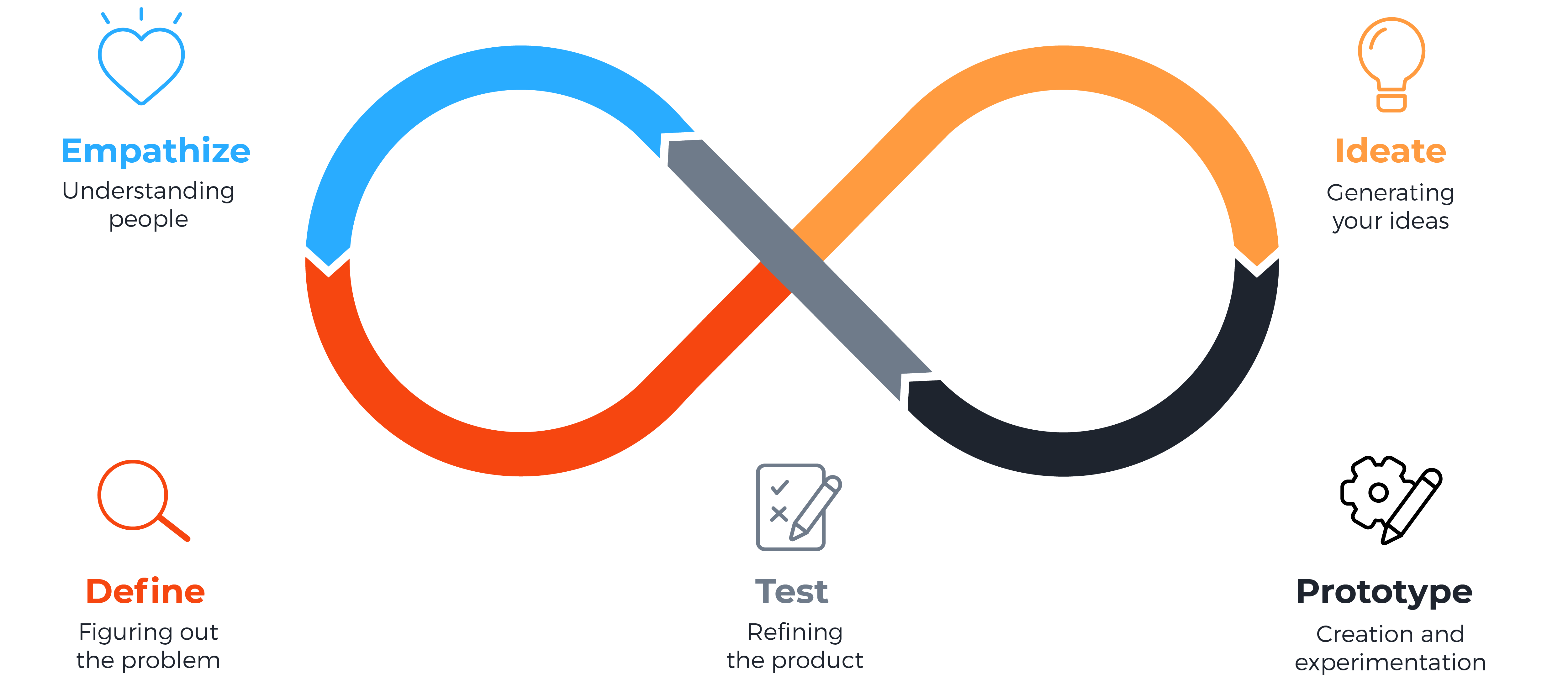
Process I Followed : Design Thinking
Quantitative Research
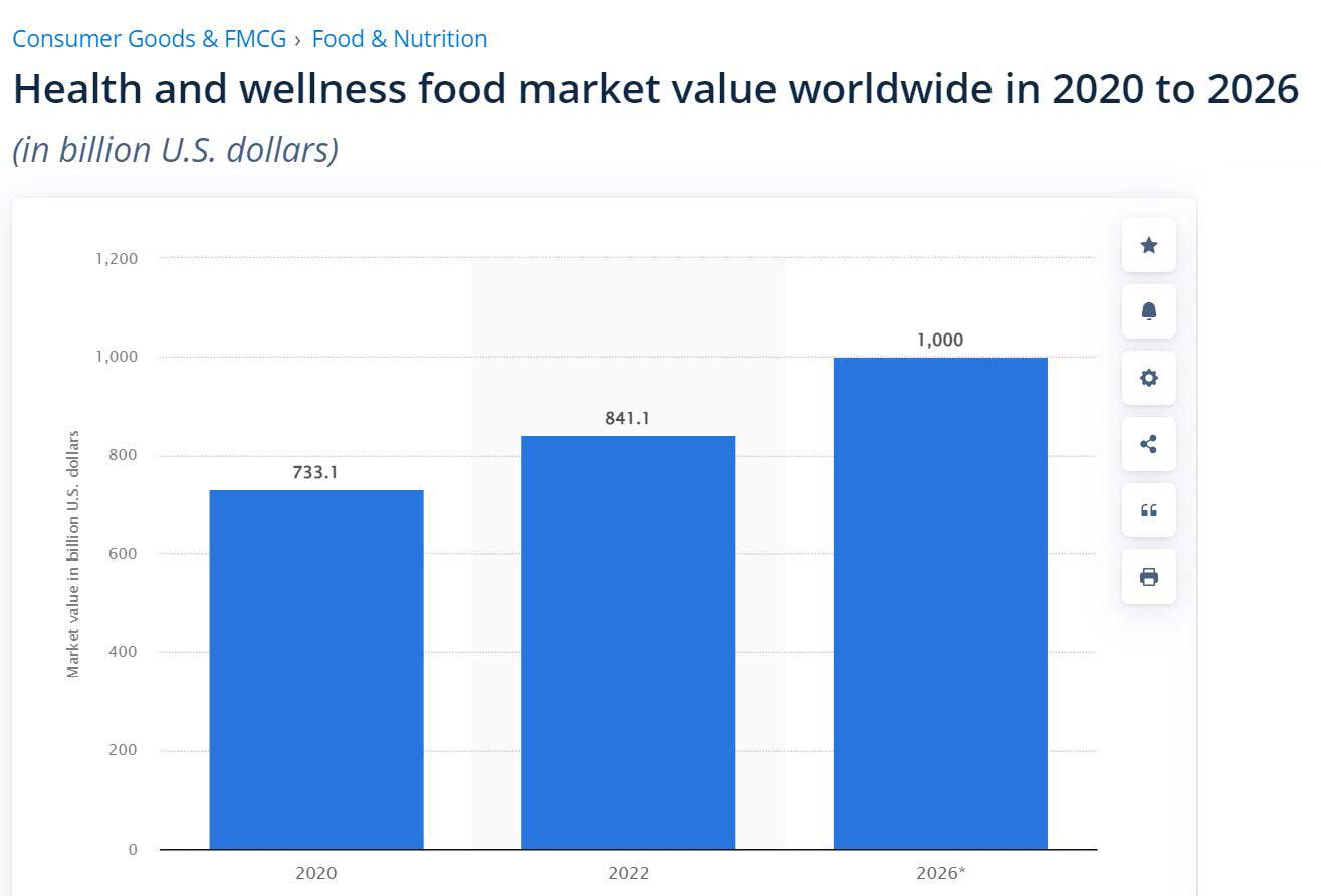
Consumer purchase behaviour for food is significantly changing across the world and consumers are becoming increasingly conscious of the health enhancing properties of food. With growing incidences of problems like obesity, diabetes, coronary heart diseases and foodborne diseases, consumers are becoming aware of the role of food in ensuring health and well-being.
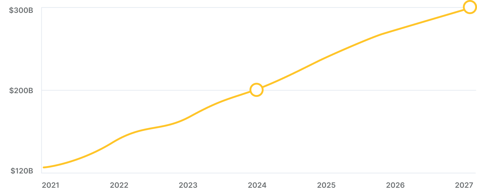
Business of Apps in their “Food Delivery App Revenue and Usage Statistics” article projects that the global market for delivery apps will increase to $120 billion by the end of 2021, reaching $300 billion by 2027.
The Claim
- Food delivery apps are becoming more and more popular.
- According to eMarketer, food delivery apps were among “the three fastest-growing categories in 2020.”
- A report from payment publication PYMNTS and restaurant tech provider Paytronix notes that “usage of both curbside and in-store are now nearly equal with the drive-thru” and that the “vast majority of takeout orders in 2020 (89%) were placed online.”
The Problem:
- With the arrival of the Covid-19 pandemic, food delivery apps maintained the flow of consuming products and buying food by ensuring that the food is delivered in a safe, socially distanced, and convenient way.
- Anne Freer from Business of Apps states that demand for contactless ordering is still increasing, “as consumers who ordered food via apps out of necessity throughout the pandemic continue to do so.”
- According to the previously mentioned report, “consumers appear to prefer ordering from a restaurant’s own app rather than a third party.” The report also stresses the fact that “more consumers than ever say they would be encouraged to spend more if their favorite restaurants offered time-saving services.”
Competitive Analysis
I downloaded and then analysed three apps, two of which are my direct competitors, and one is indirect. I compared the ordering experience of each competitor’s app as a new user and a returning user. What’s more, I also juxtaposed negative comments from the App Store and Android App Store to get the essence of what the users struggle with the most while using them and what they are not too keen on.
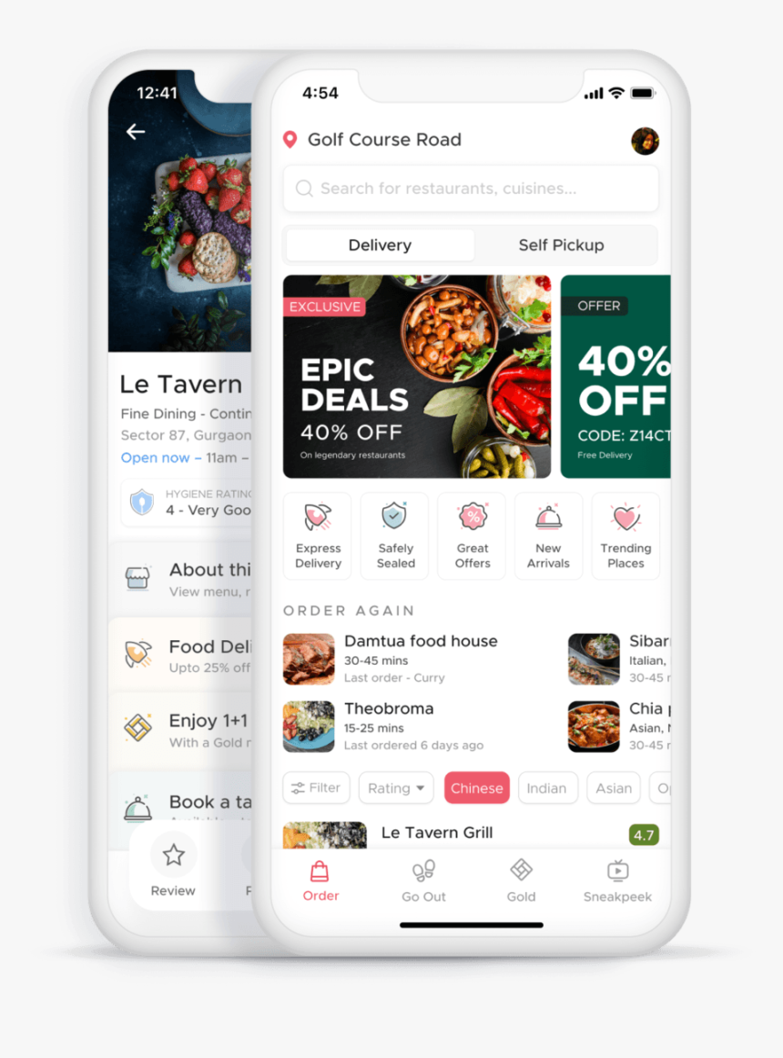
ZOMATO:
The Good:
- The app has simple, modern, and clean design with big headings and colours with high contrast.
- The meaning behind the UI icons is explained.
- The ordering process is smooth and there are many filters and categories of products.
The Bad:
- The navigation is unintuitive and takes time to get used to.
- Not perticular with the list of ingredients, sometimes too long sometimes even it is not there.
- Names of some products are clipped and too much text used.
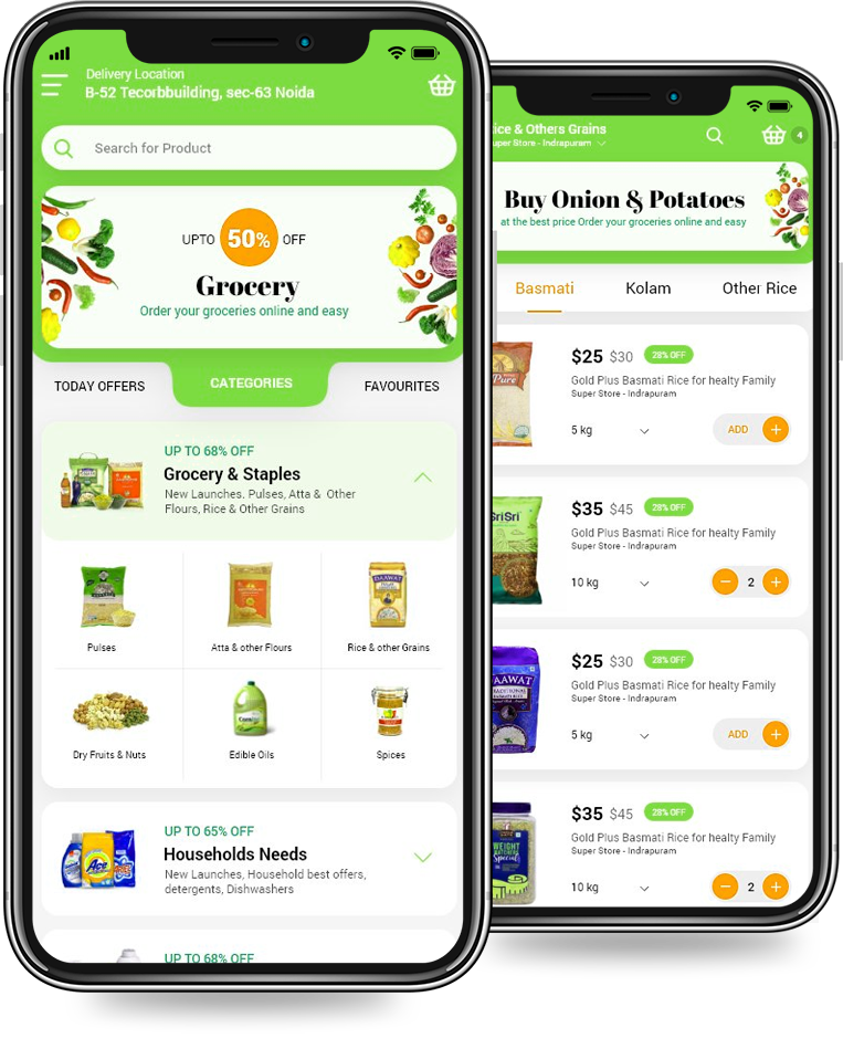
SWIGGY:
The Good:
- The navigation icons are big and have labels under them.
- There are filters for different food allergens, such as eggs, nuts, etc.
- The app is available in different languages.
The Bad:
- The use of breathing space can be better.
- There are many facilities and options which Swiggy provides, but due to poor segregation of those facilities and options available, the app ends up confusing users at some point. Also, the appeal of visual design like use of images and video is not consistent.
- Currently we cannot place order from two or more different restaurant at same time.
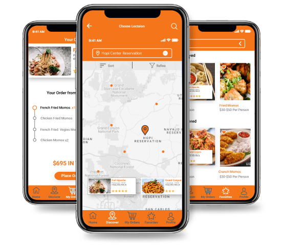
DUNZO:
The Good:
- Modern and clean design with big headings and colours with high contrast.
- It has other options too like pick-up & drop packages, delivery of groceries, essential, fruits & vegetables
- Clear brand identity, including colours, logo, typeface, style, motion, imagery, and photography.
The Bad:
- Icons can be better
- So many colours used in so many places
- Poor Navigation
Problems from the comments:
"Coupons shows expired without using ( confirmed from online support that coupon code was never used) and app shows expired 15 days earlier to expiration date. They don’t respond to emails."
-Anil Kumar
https://www.trustpilot.com/review/
"Terrible customer service. Despite sending them pics of what I ordered and what I received - a double chocolate cake vs. a white cake, they refused to do anything with the bakery and/ or refund my money. Ridiculous and unacceptable!"
-Nutan Yadav
https://www.sitejabber.com/reviews/
"They are just pathetic they mark deliver even customer never received product. They never ever refund your money. Bad quality products they have in their list."
-Bharat Singh
https://www.mouthshut.com/product-reviews/Dunzo-reviews-925923719
User survey
I conducted a quick survey among people who use food delivery apps with a tracking system on a regular basis on Facebook.
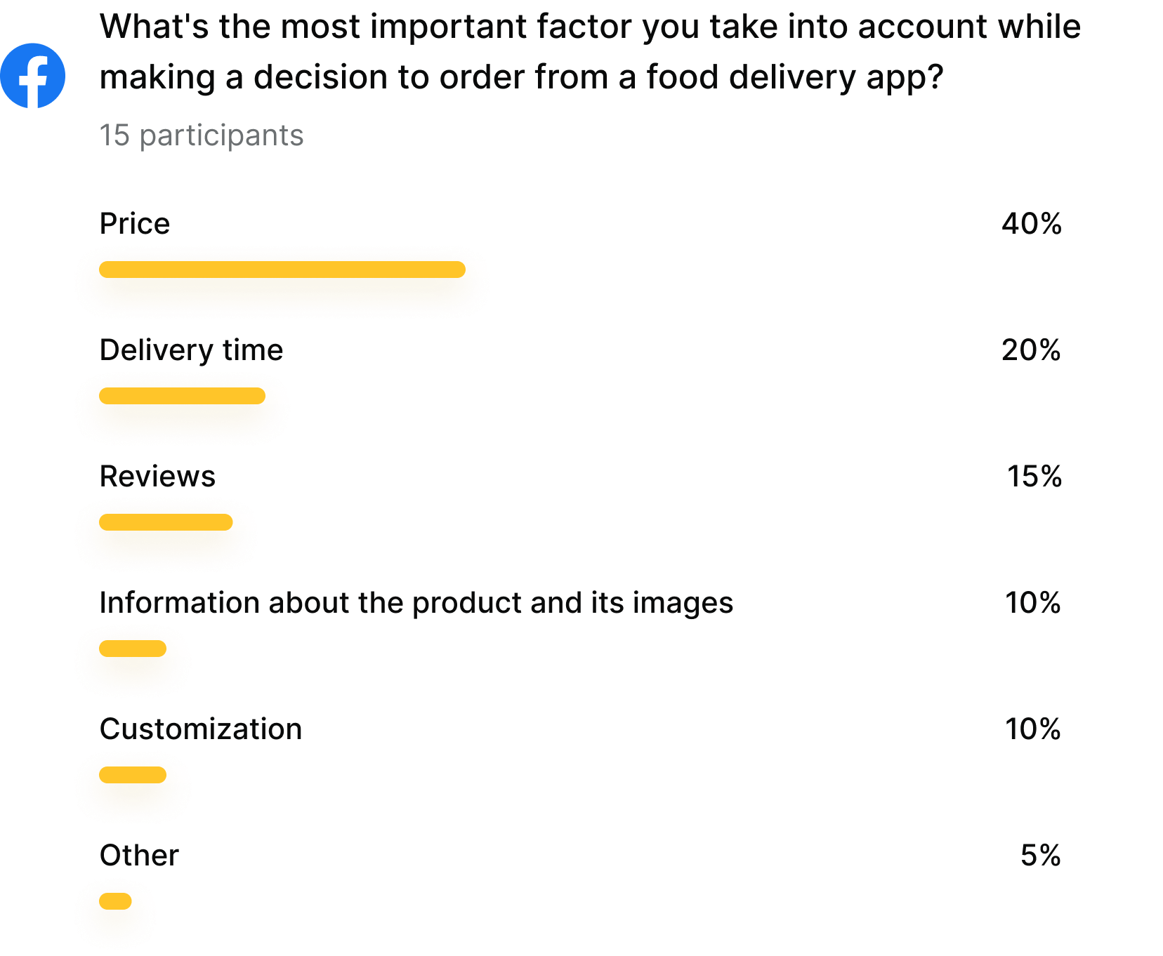
Initial Research Result
As the carried out research shows, there is a growing need for food delivery apps, and every company that provides services should have one such app.
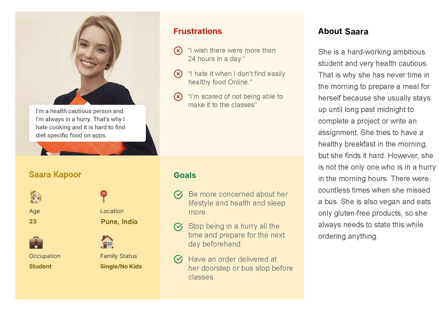
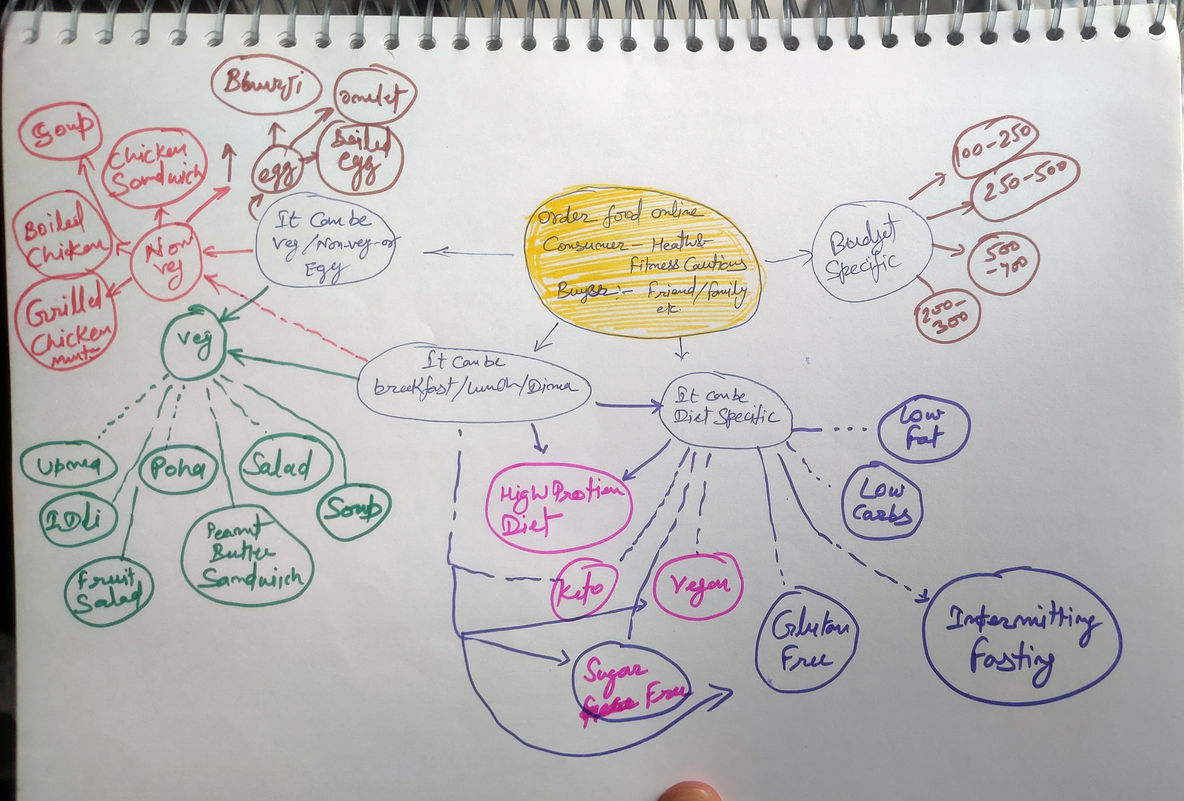
Personas
I created two personas to help me explore the needs of a larger group of users and design my app with specific target users in mind.
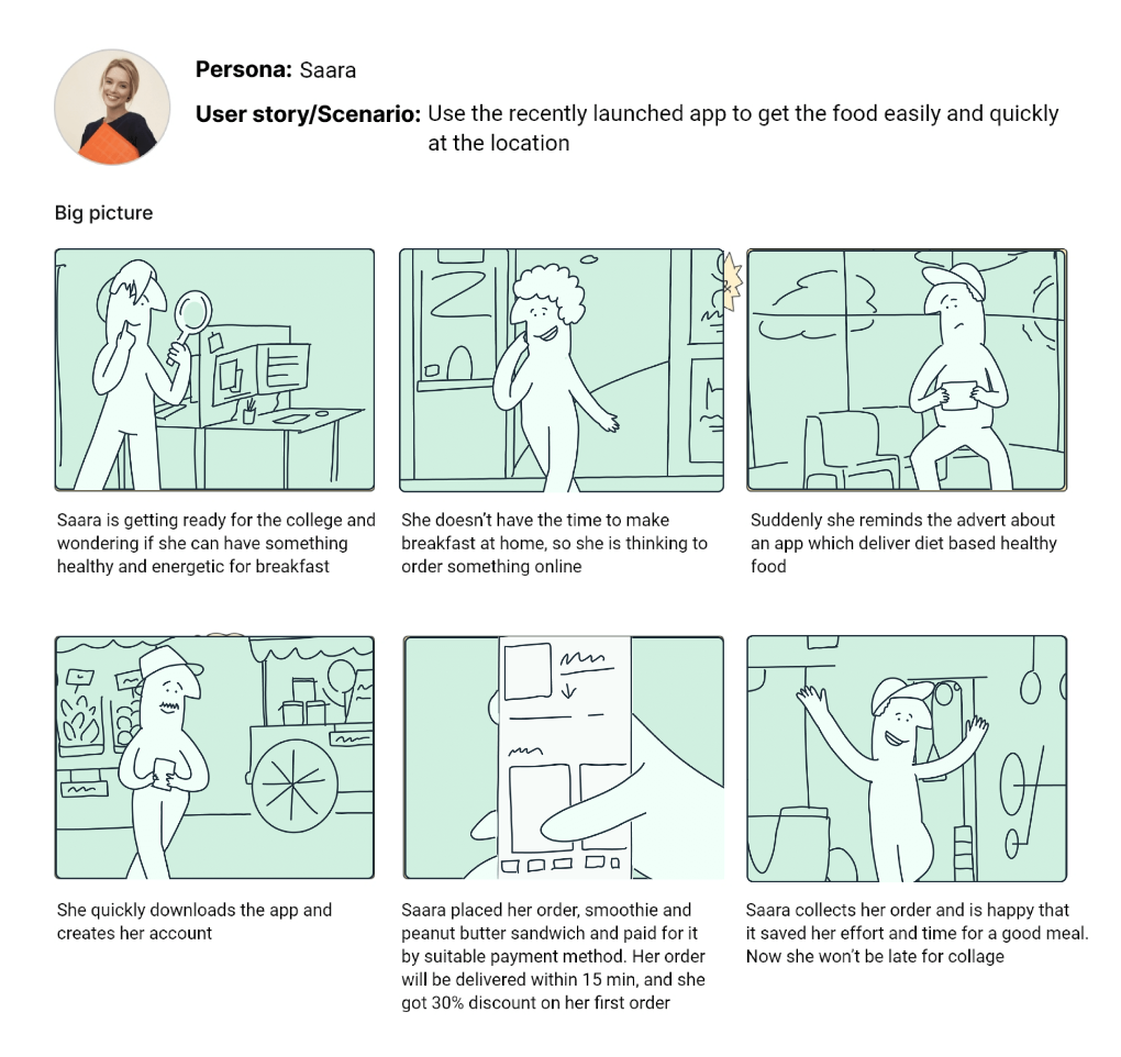
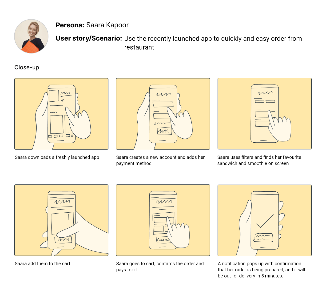
Storyboarding
I then designed UX storyboards for one persona to help me visually predict and explore a user’s experience with my app. These were created using Storyboard Mix-and-match Library.
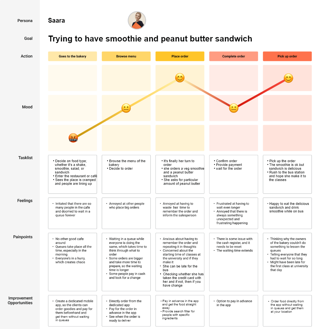
User journey map
Next, I created a user journey map to identify the pain points and feelings the customer might go through while ordering in the traditional way. I also enlisted solutions to the problems my app would solve.
TIME TO START DESIGNING!
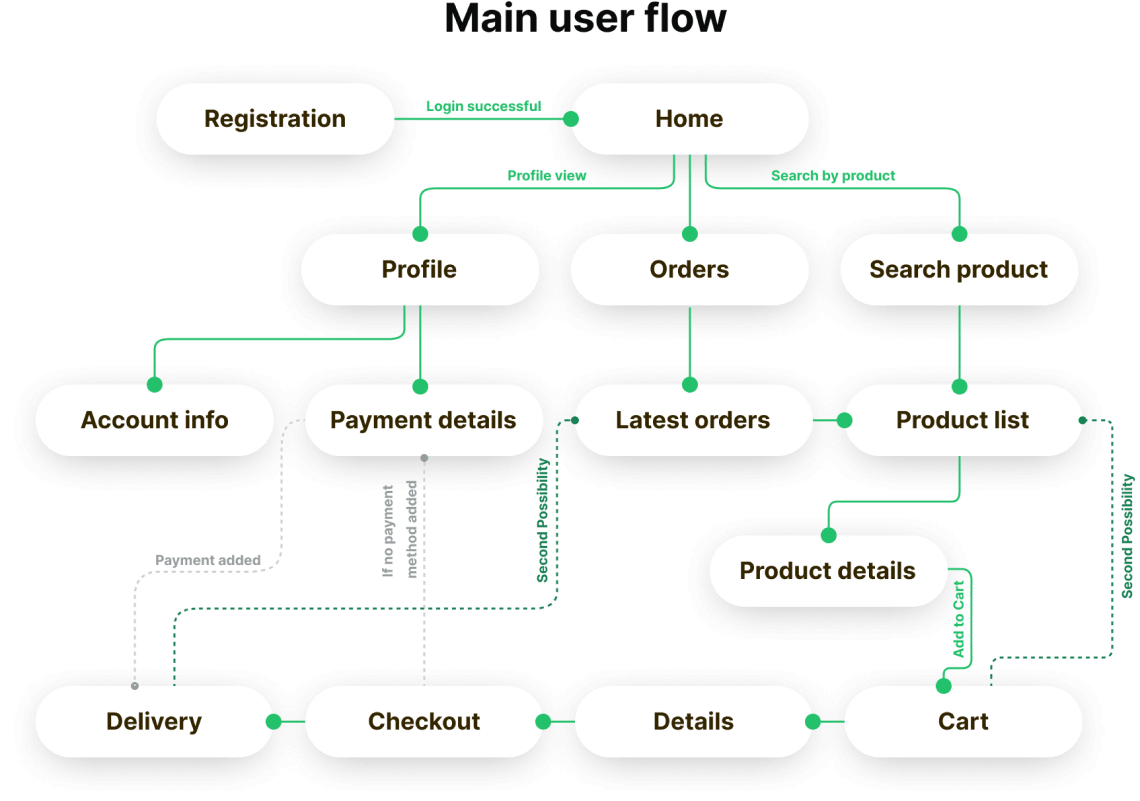
Once I went into my end user’s head, it was time to sketch out the first flows and the initial low-fidelity wireframes, as well as a prototype based on them.Flow diagram
To outline all the necessary functionality, I created a simple flow diagram of the main tasks the user can do. One of the flows is shown below. Fall state flows were also created, but are not shown due to space constraints.
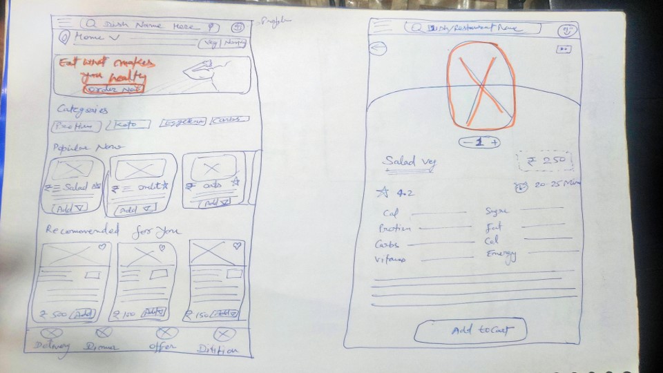
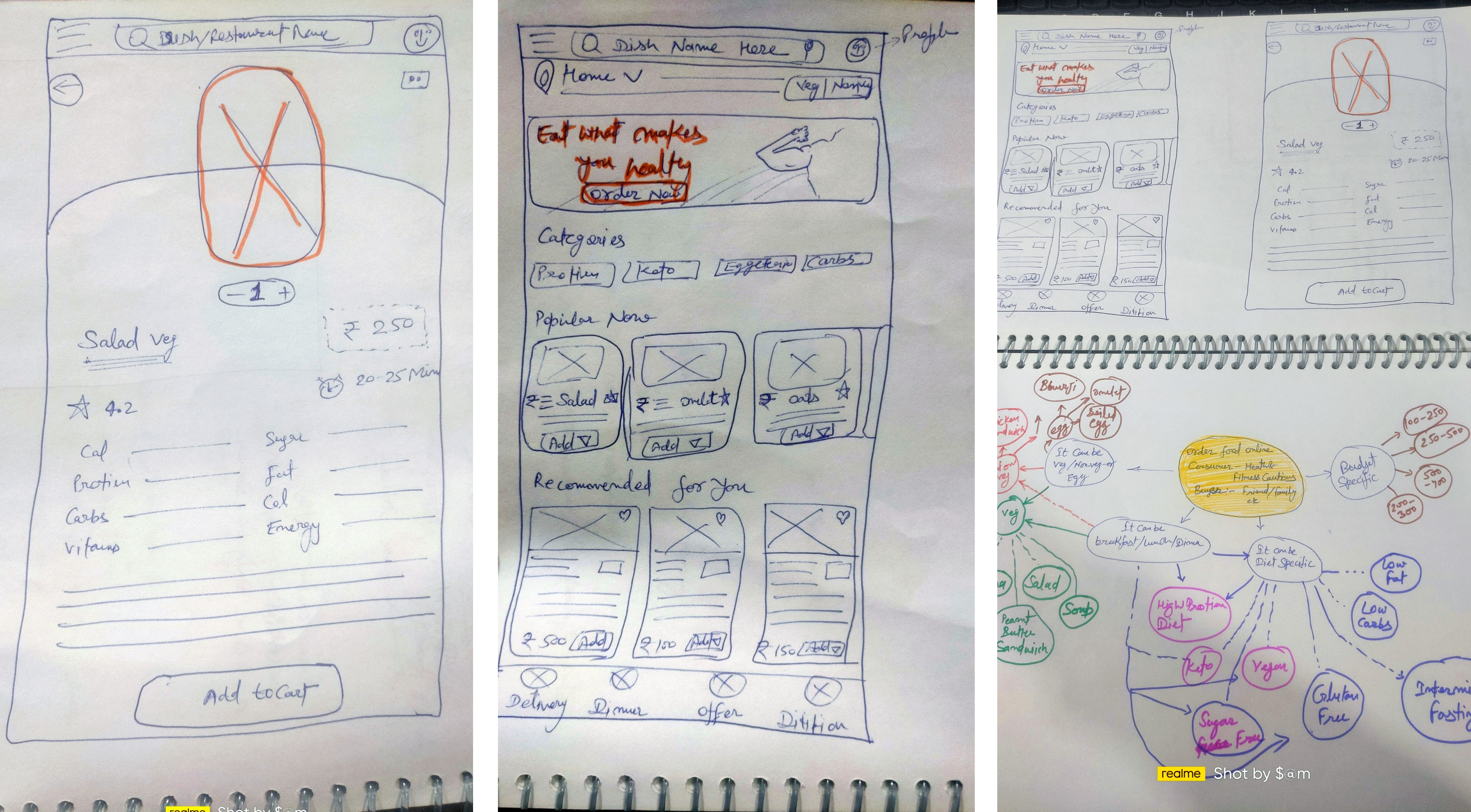
Wireframes and initial insights
Once the flow diagram was established, I started sketching with pen and paper the low fidelity wireframes of the main user flow.
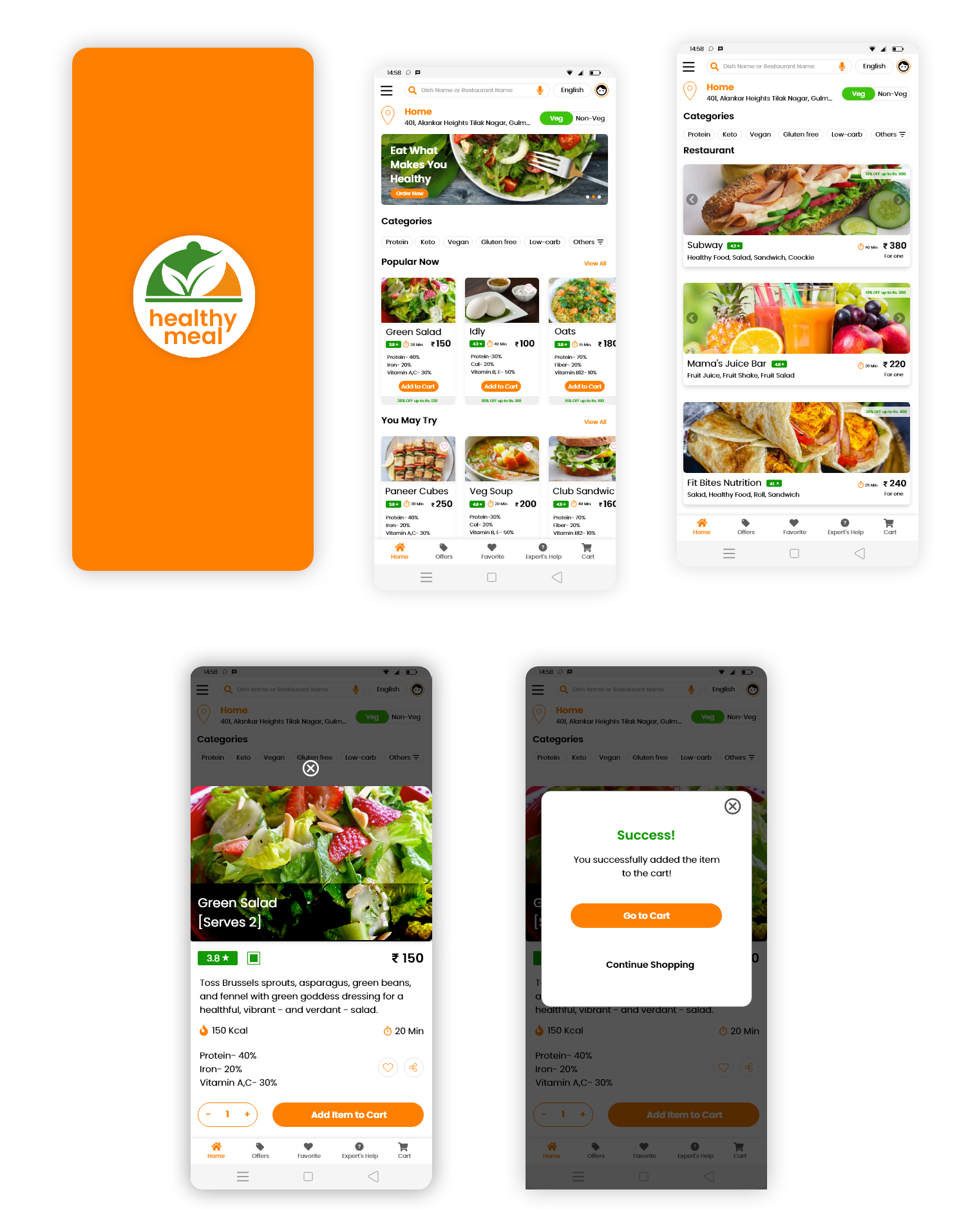
High-fidelity UI Design
Project Summary
During the project, I managed to evaluate the market research, do a quick user survey, create a set of lo-fi wireframes, build them into hi-fi UI designs, connect them into a prototype, and perform a mini usability study. This was a demanding and time-consuming but very insightful journey. I learned a lot throughout the whole process but I’m not resting on my laurels. There is a lot of room for improvement and many things to learn.